
From ancient cave drawings to flashing billboards, humans love leaving their creative mark. Written communications, they’ve been the rage for the last thousand plus years or so.
The trick though is effective communication, in all forms. In writing this means efficiency, clarity, and of course using the right font!
Wait, what do fonts have to do with this? Actually a lot, and not just for marketing teams and billboards. Fonts carry their own perceptions, impacts, and influences on the written messages.
So let’s deep dive into the impact of a font on display intent, improving readability, and delivering utility. It’s tactical, practical, and more efficient! Winning all around.
Executive Summary
We are going to dive into some font families, discuss their strengths and weaknesses, and talk about some typography histories:
Serif fonts: Best used for print material, often used to convey an official tone.
Sans-serif: Means “without-serif”, use for viewing content on a screen. Pixels don’t display serifs well.
Comic sans: Known as the informal and friendly font, comic sans lowers the pressure of getting text on the screen. Sometimes we shouldn’t take ourselves too seriously.
Dyslexic fonts: May help in some situations. See if they work for you!
Want the Font(s)?: Compare the multitudes of fonts in a quick viewer. Some fonts cost to buy/use, some don’t. Sometimes it depends on the application.
A Case for Letters: Typography has a long history. Do you know where “upper case” and “lower case” come from?
Serif vs Sans Serif: Definitions


Serif Font 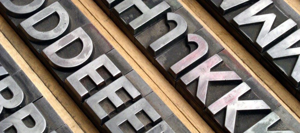

Sans Serif Font
Let’s start with some definitions, to ensure we are on the same page (pun intended):
Serif: Any of the short lines stemming from and at an angle to the upper and lower ends of the strokes of a letter (Webster)
Sans: Without (Webster)
Sans Serif: A letter or typeface with no serifs (Webster)
At a high level, we can group fonts into two broad categories: those with and those without the little angle-pointy-lines on the ends of letter strokes. Above, in the photo on the left (“Friends”) is a serif font and in the photo on the right the block letters are sans serif.
Serif vs Sans Serif: History
Serif fonts took root with the ancient Roman Empire, thousands of years ago. We can still see ancient Latin inscribed into stone with serifs on the letters. The Latin alphabet spread, and eventually printing presses began distributing pages displaying even more serif fonts. Sans serif fonts are a more recent addition, gaining popularity roughly a hundred years ago. There’s a new (sans) serif in town!
While sans serif fonts made their way onto the print scene before electronic screens, the shape of the letters work exceptionally well when reading on modern pixel displays. Fonts with serifs do not display as well when pixels are involved because the grid of pixels has trouble displaying the detail of the fine pointed strokes of the serif.
The image below, which shows a close-up of text on a full HD (1920 x 1080) computer screen. On the left we have Calibri, a sans serif font. On the right Times New Roman, with serifs. Take a look at the “C”: notice how the ends of the lines and strokes on the left are sharper and darker compared to the right “C”, where it gets a bit fuzzy? The fuzziness strains the eye making it harder to read (much less efficient!). The pixels just aren’t small enough to define that sharp point.
Why does this matter? Short answer: different fonts work best for different purposes and different media.
For example, here at RamSync we use Open Sans for our general web text. We believe it is a modern font that works really well on all types of screens. It is efficient (!), readable, and professional. However, Open Sans is just one good option among many. Consider your purpose when choosing a font.
Comic sans
Yes, we are going to talk comic sans! Sometimes we shouldn’t take ourselves too seriously. This font is perfect for first-draft, content creation, and brain-storming.
By disconnecting the brain-storming stage from the desire to polish, comic sans’ inherent goofiness can push us past the need for perfection. Great for breaking out of writer’s block, or simply brain-dumping, we intuitively know anything written in comic sans is going to require additional edits, if only to come back and make it look pretty.
So, at the creative stage, beat the block and give comic sans a try!
Prof Tip: Don’t forget to change the font to something more professional before handing it off to instructors or colleagues! Seriously, it’s a rookie mistake to turn in a university paper in comic sans.
Dyslexic Fonts
Over the last few years, growing interest and offerings have generated several fonts for those with dyslexia. These specialty fonts are designed to increase readability, especially when readers may jumble or flip letters.
Two of the more famous fonts in this category:
Dyslexie Font: A paid font (more on paid fonts later) that may help some people with readability.
Open Dyslexic: A free font with a strong following.
As of right now, it doesn’t appear that there is especially strong research on dyslexic fonts in general. It’s possible that spacing is more important. However, for those reading or writing a lot, it may be worth taking a look. One, or more, of these fonts may click for you and improve reading efficiency.
We will end this section like good researchers and state that additional research into the area of font readability is needed. This additional research could provide wide-spread benefits and broaden humankind’s understandings of font factors in connection with general comprehension and reading speed.
Want The Font(s)?
While many fonts can be found for free, some programs have specialty or paid fonts that may or may not be transferable to other applications. Fonts can fall into the intellectual property category, and as such can be owned or have usage rights sold or assigned.
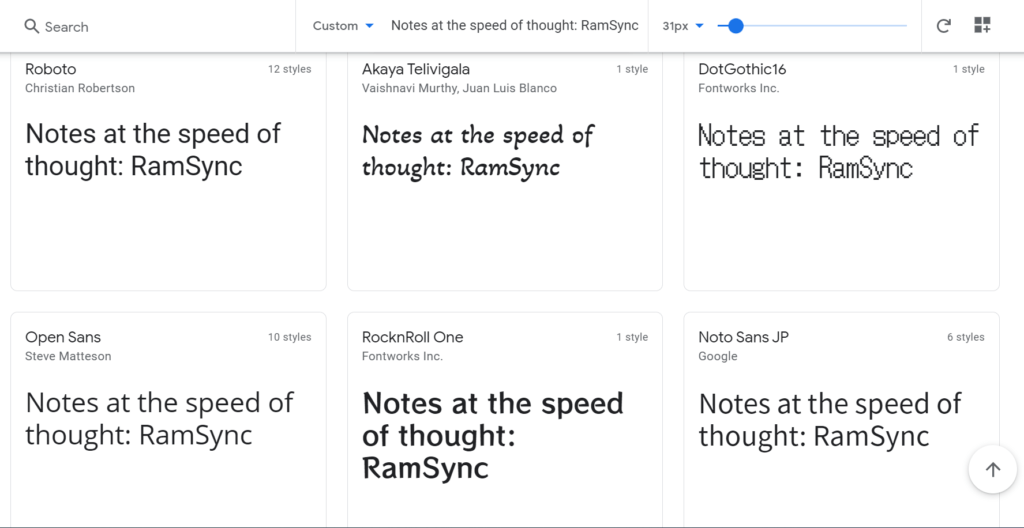
In general we like free or open source fonts, it’s efficient for the pocket book! Google has a wide variety of web fonts available for easy, free use. Browse through a few in the font explorer at Google. It allows for testing out fonts on your own sentences for quick comparisons.
Downloading and installing fonts one by one can be time consuming. Maybe you want ALL OF THE FONTS (or at least a wide variety). For example, those who use Gimp, an open-source graphics editor, will likely want to add more fonts to the paltry few available on install.
Well, Google has a solution, with an easy zip file from GitHub: github.com/google/fonts (only download zip files from trusted sources). Extract the files and add them to your computer’s fonts for use in all programs.
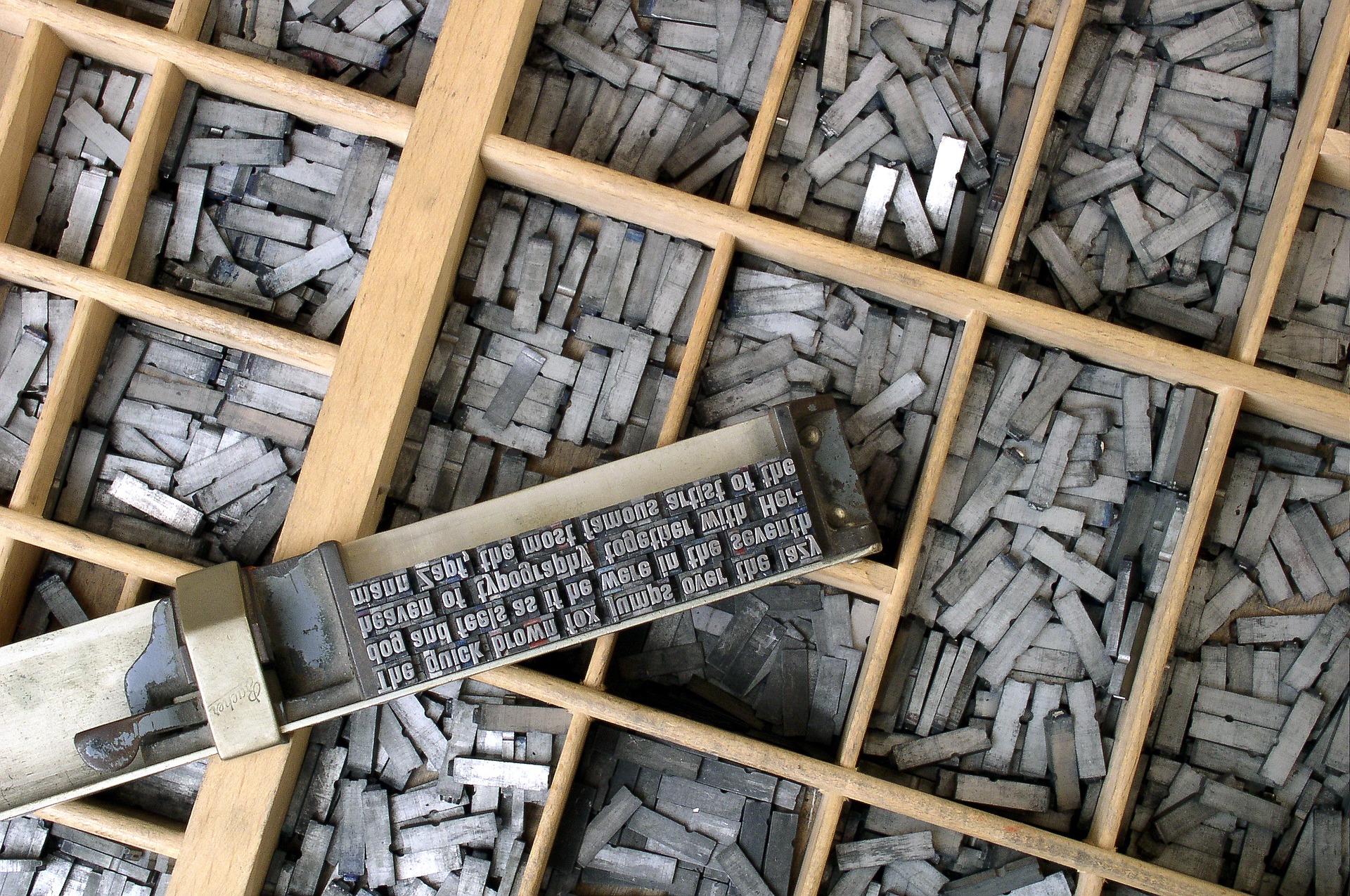
A Case for Letters
Nerdy historical fact: The terms “uppercase” and “lowercase” terminology referring to letter capitalization get their roots from the days of the Gutenberg and movable type printing press. The printing press leveraged metal letter stamps to transfer ink onto a page, greatly speeding up book production across Europe.
With an old printing press, typesetters manually placed each letter stamp to form the text for a page or frame. All of these letter stamps had to be stored and arranged for easy access. The wooden storage trays, or cases, kept the little metal letters organized and within reach.
Capital letters were stored in the “upper” case, while the smaller letters in the “lower” case. The typesetters’ terminology stuck, and hundreds of years later we are still referencing the case location of letters, way back from the days of the printing press. Cool, right?!

RamSync
RamSync let’s you customize your notes with fonts, as well as past ideas and content directly in from Microsoft Office. So it doesn’t matter if you are using Impact for important ideas (its a bold font), or Verdana (sans serif) to organize your own Zettelkasten, RamSync is flexible to meet your needs.
Take a look at the RamSync Quick Start guide to see how RamSync can power your own notes and ideas.
Do you have questions about what RamSync can do for you? Drop us a note and we’ll get back to you quickly!
Know any fun font facts you want to share? Leave a comment below!
Learn More
Would you like to create your own unique font? You can use your own handwriting to build a font file with the Calligraphr site or this Microsoft app.
There’s pages upon pages to learn about the history of print and the inventor of the printing press.